How Stephen Gould Scaled Its Capacity by 30% without Making a Single Hire
Machine learning visualization. It can sound intimidating, no? But it's actually a pretty empowering move to make for any business. Tapping into the knowledge of how to master it quickly and make better decisions can start right now - by diving into this article.
The power of data visualization can empower any business. That includes immense improvements in:
Tapping into the power of machine learning visualization is what you want for your business.
Machine learning (or ML) is a segment of artificial intelligence (or AI) that helps with predicting outcomes by learning from experience and patterns. Machine learning uses algorithms to predict new output values through the usage of historical data. Through machine learning, software applications become much more accurate in predicting users’ desires and expectations.
The process of machine learning includes:
The primary goal of machine learning is to let computers learn automatically without human assistance and adjust their actions according to their learnings.
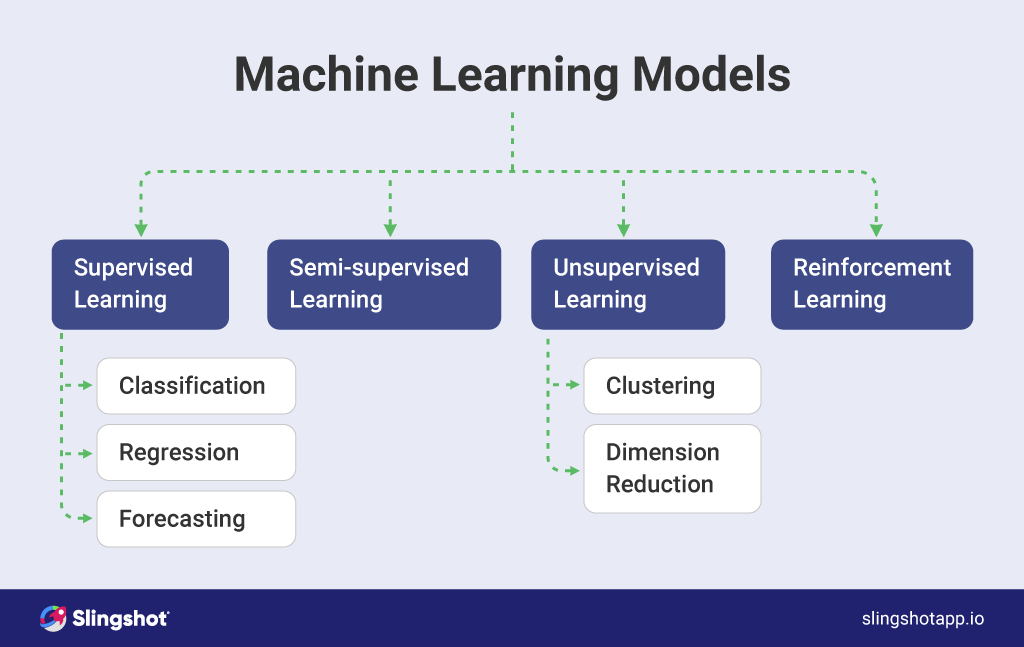
There are four main types of machine learning algorithms (or models) that can be observed to understand the logic behind machine learning better. These are:
In the cases of supervised learning, the machine contains mapped input variables (x) and output variables (y) for the model to learn from. The end result is when new input data us formed you can predict the output more accurately. Supervised learning includes:
Although similar to supervised learning, semi-supervised learning uses both labeled and unlabeled data – meaning, the information with meaningful tags and the information lacking them. Combining both, machine learning algorithms learn how to label unlabeled data.
In this type of machine learning, the algorithm studies data to identify patterns and analyze available data. These algorithms only have input variables with a goal to model the underlying distribution of data. Large data sets are interpreted and organized to determine their structure and the ability to make decisions is refined. Unsupervised learning includes
Here, we have the focus on the regimented learning processes, where a machine learning algorithm explores different options and evaluates them to find out the most optimal, leading to the best possible result.
Machine learning can be expressed and used in many scenarios with data visualization. So, what is model visualization?
With data visualization, people receive interactive visuals within a context, translating data into a form that helps people understand better trends and correlations important to their business. Маchine learning brings more value to visualizations of data by providing more predictive, relevant, and effective data.
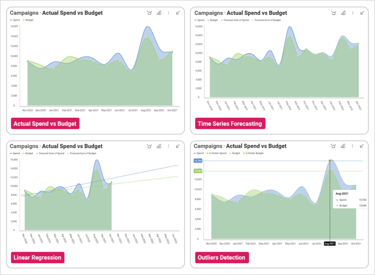
Machine learning visualization provides several benefits.
With machine learning the data collection happens via algorithms, so it’s very time-efficient, in addition to the increased accuracy.
Because machine learning tracks the users’ behavior on a more personal level, with data visualizations you are provided with a more accurate portrait of how these users will best engage and in what way
With machine learning, decision-makers receive a new type of certainty, validation, and insight that bring a greater level of trust in the predictions made.
То integrate data visualization and machine learning is a good way to understand data better and bring forward correlations that you wouldn’t have seen otherwise. Different types of machine learning data visualization are
Intuitive representation of machine learning can provide great help for many stakeholders on the informed choices they need to make.
The value of data is that it takes storytelling to new levels. That happens when information is easy to digest, understand and gain insights through patterns. Hence – data visualization.
No matter what business you are in, delivering data in a visual form is vital to understanding it in the most efficient way possible and reach conclusions that are actionable to improve your future decisions. With data visualization, you communicate information to:
Data visualization should be used by anyone who wants to
Data visualization is the perfect tool for observing new opportunities and emerging trends that could not be spotted so easily otherwise. With data visualization techniques, market shifts can be spotted, consumers’ reactions and preferences – better understood.
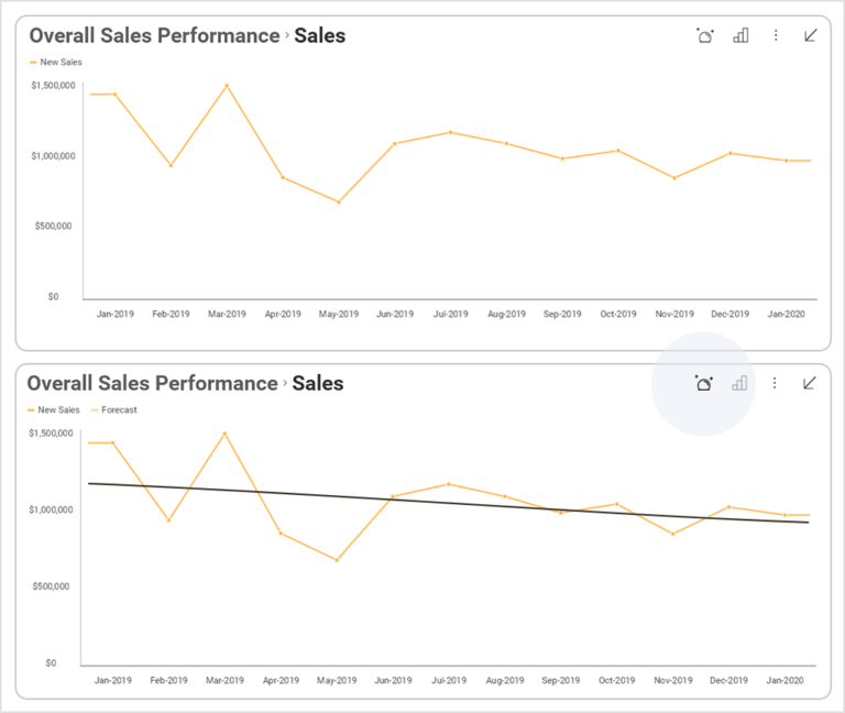
Without data visualizations, a significant amount of time is spent sifting through large amounts of data, tagging the most important pieces, analyzing them, and creating detailed reports. Besides being time-consuming, this whole process would require the time of a trained person with an aptitude for data science, appropriate systems, and a way of thinking. With the right software, however, data visualizations are created in seconds, allowing you to always have the most recent dashboards of up-to-date information.
Traditional forms of representing data are often not so accurate in revealing patterns, hidden insights, and factors that lead to success. Utilizing data visualizations, however, leaves no stone unturned – and that goes for business insights, customer behavior, project performance, campaign management, and pinpointing which operations need improvement.
Mistakes are part of all business operations, and a great learning opportunity. Visualizing data means visualizing errors and quickly identifying areas for improvement, erroneous actions that lead to undesirable results, and this analysis is all you need to rally your team around the correct next step.
Data visualization helps provide transparency and trust that validates decisions for the future by bringing knowledge and understanding to the story, managing huge data loads, and making it actionable.
In data visualization, interpretation needs to be customizable and serve as per the specific use case. Here are some of the most used chart types for visualizing machine learning models.
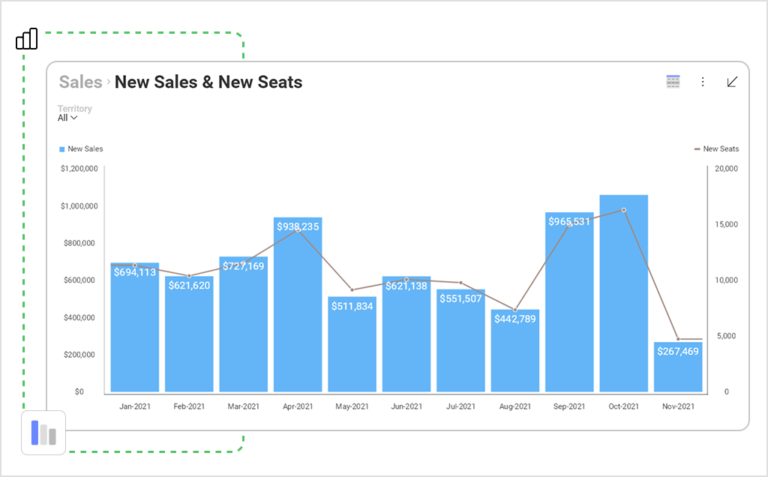
Through charts and graphs, which are one of the first types chosen for data visualizations, the overall story of data trends is told in a much faster way. They provide quick comparison and a better way for data analysis in the long term.
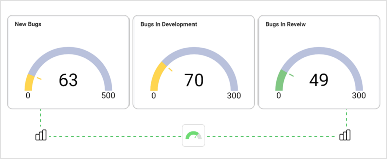
This type of visualization provides an overview of the information as a reading on a dial. It can help you quickly discover how a certain project, campaign, or numbers are performing versus how they are expected to perform.
This visualization shows the distribution of your data and helps in drawing probability conclusions. They can quickly demonstrate whether a process is hovering around the right mean or whether outliers are skewing results for data or outcomes.
They illustrate what factors are at play in a process. Various versions of pie charts are good if you need to see whether each part of the whole is pulling its weight, or you want to see what factors are most important in a process or outcome.
These are data visualization tools that show hierarchical data using nested nodes (rectangles) of varying sizes and colors, making it easy to spot data patterns or to compare data quantities.
Data visualizations written in languages Python help identify trends, patterns, and correlations that you might have otherwise never discovered. To dive more deeply into the topic, check out our article on data visualization with Python.
Using R as a data analytics language lets developers and data scientists create various types of visualizations to represent complex, raw data with minimum coding. By using R’s diverse functionalities, you can create appealing data visualizations by writing only a few lines of code. To create data visualizations, R provides several visualization libraries including ggplot2 which is one of the most widely used packages. To read more on why R could be the answer for your data visualizations, go to our article on Data Visualization in R.
In choosing your data visualization software, you need to make sure it’s able to connect to all the data you have in different systems and build a dashboard to bring all of it together into a full 360-degree view of your business.
This is exactly what Slingshot can do for you – it’s an all-in-one digital workspace and a tool that is able to aggregate data analytics, project and information management, chat, and goals-based strategy benchmarking – all in one, intuitive app.
Furthermore:
