Adding the other Visualizations
All the remaining visualizations in the dashboards will use the same sample spreadsheet.
Note
If you want to change your data source, you will need to select the overflow button next to the data source name or create a new data source instead. You can also duplicate visualizations to speed up the creation process.
This section will cover the following visualizations:
|
|
|
|
|
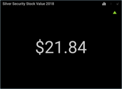
Silver Security Stock Value 2018
The SIS Stock Value 2018 visualization displays the average value for the Soylent Corp stock during 2018 in a text gauge. In this case, you can duplicate the first visualization created during the first steps, as all that will change is the selected filter.
Open the overflow button in the "Globex Stock Value 2018" visualization, and then select Duplicate.
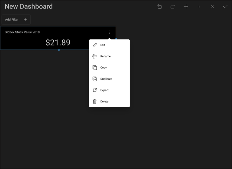
Rename the visualization by opening its overflow button and selecting Rename.
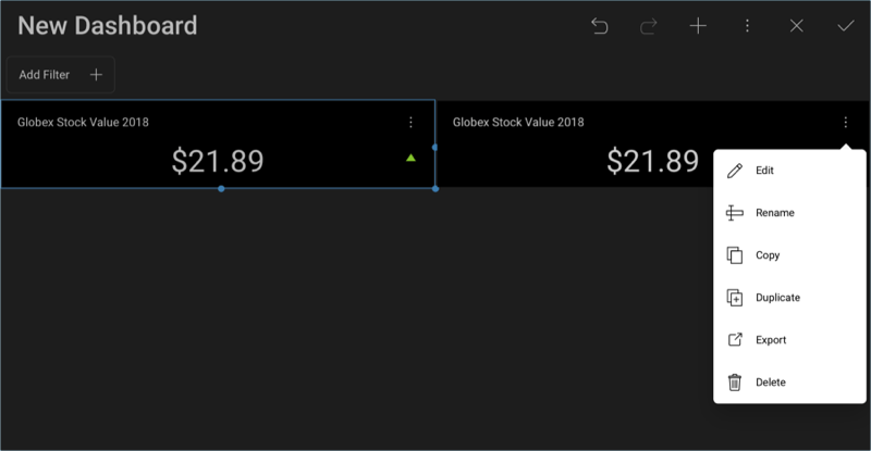
Set the value to "Silver Security Stock Value 2018"

Enter Edit Mode by selecting the overflow button again and selecting Edit.
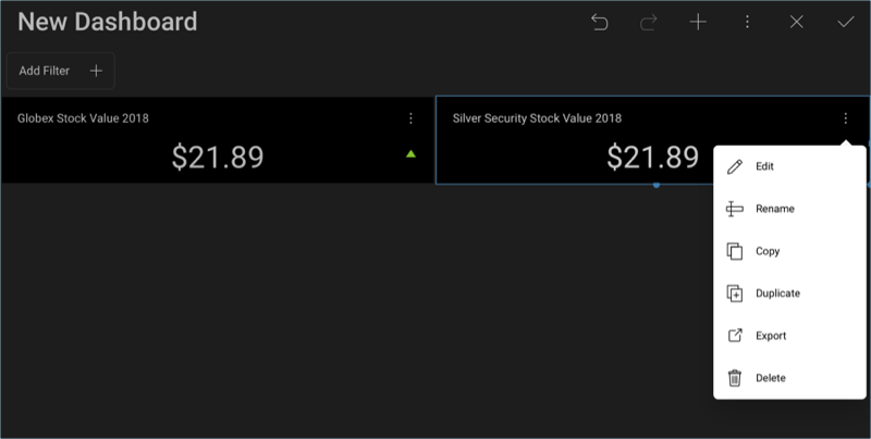
This visualization displays the stock value for Silver Security Corp, as it is the second highest stock value. Because we choose to duplicate the visualization, the number you are seeing in the text gauge corresponds to Globex. In order to change it, select the Stocks field in Data Filters. Then, change the Selected Value to Silver Security Corp and unselect Globex.
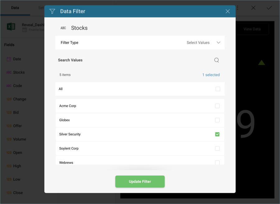
Then, select Update Filter.
Once you are done, go back to the Dashboard Editor by selecting the tick icon in the top right-hand corner.
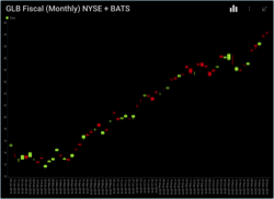
GLB Fiscal (Monthly) NYSE + BATS
The GLB Fiscal visualization displays the price movements for the Globex stock during 2018 considering both the New York Stock Exchange (NYSE) and the Better Alternative Trading System (BATS) values in a Candlestick Chart. In order to create it:
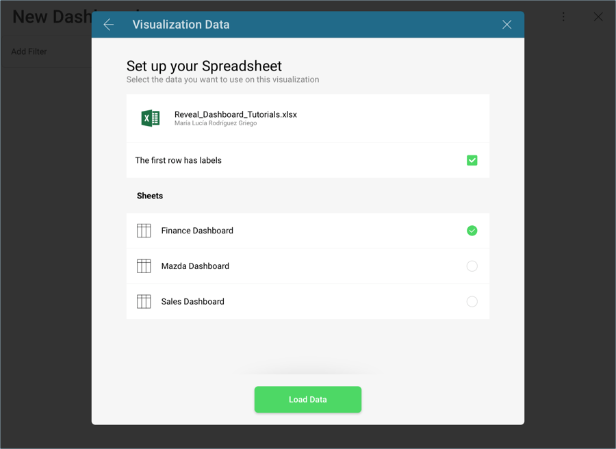
Select the + button in the right corner of your dashboard, and select the Finance Dashboard sheet in the Analytics_Dashboard_Tutorials spreadsheet. Then, select Load Data.
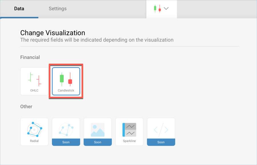
Open the visualizations picker by selecting the grid icon in the top bar, and select the "Candlestick" chart.
In the Data Editor, drag and drop the Date field into the Label placeholder of the data editor, Open into Open, High into High, Low into Low and Close into Close.
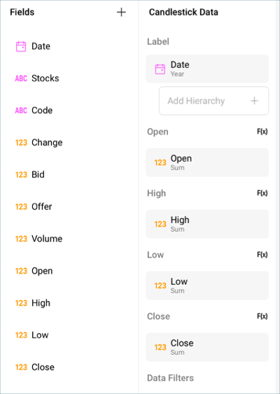
By default, the Date information in Label will be displayed in years. In order to change this, select Date in the Label placeholder of the data editor, and change the Date Aggregation to Day.
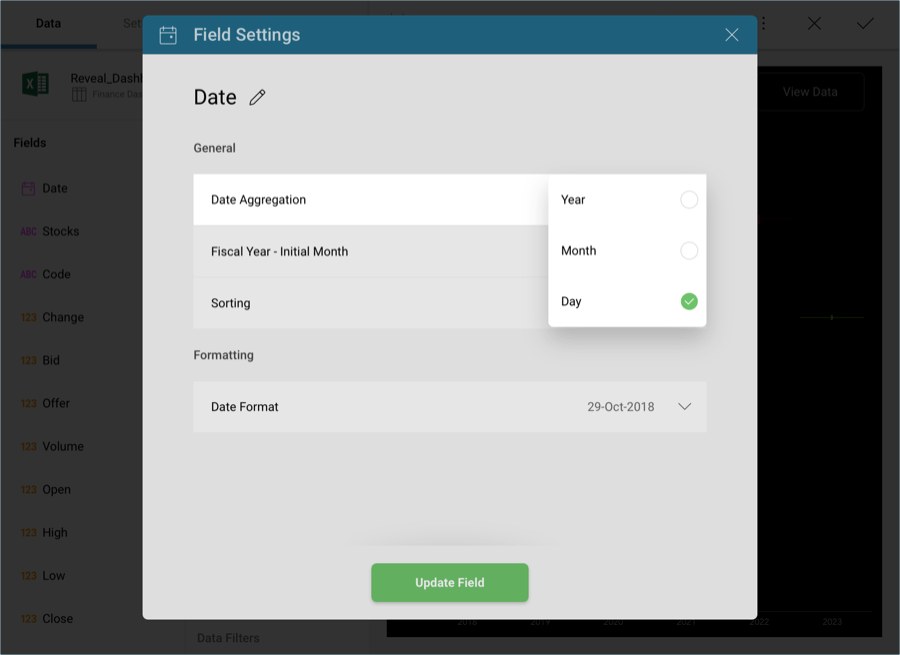
Then, select Update Field.
If needed, you can remove the fraction digits in the Y axis by selecting the values in Open, High, Low and Close, and changing Fraction Digits to 0.
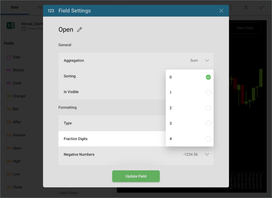
Then, select Update Field.
The visualization displays the GLB stock value, so you will need to introduce a filter for Stocks in order to display that particular option. Drag and drop Stocks into Data Filters and then choose Select Values.
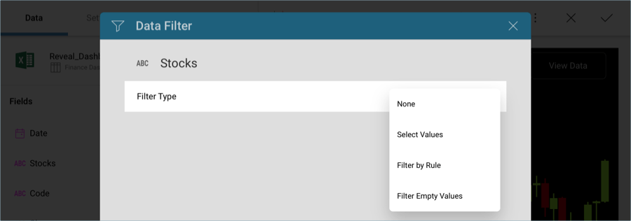
There, uncheck all options and select only Globex.
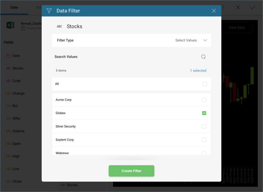
Then, select Create Filter.
You will also need to introduce a filter in order to display information only for 2018. To do this, drag and drop Date into the Data Filters placeholder of the data editor and, under Filter Type, select Filter by Rule.
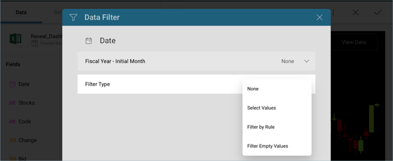
Select the Custom Date Range rule and enter January 1st through December 31st.
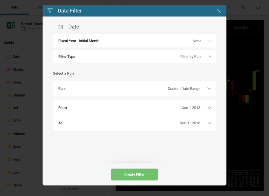
Then, select Create Filter.
Change the title of your visualization to "GLB Fiscal (Monthly) NYSE + BATS" by selecting the pencil icon next to "Finance Dashboard".
Once you are done, go back to the Dashboard Editor by selecting the tick icon in the top right-hand corner.
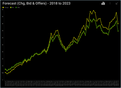
Forecast (Chg, Bid & Offers) - 2018 to 2023
The Forecast visualization displays the changes, bids and offers for all stocks for a 5 year period in a line chart. In order to create it:
Select the + button in the right corner of your dashboard, and select the Finance Dashboard sheet in the Analytics_Dashboard_Tutorials spreadsheet. Then, select Load Data.

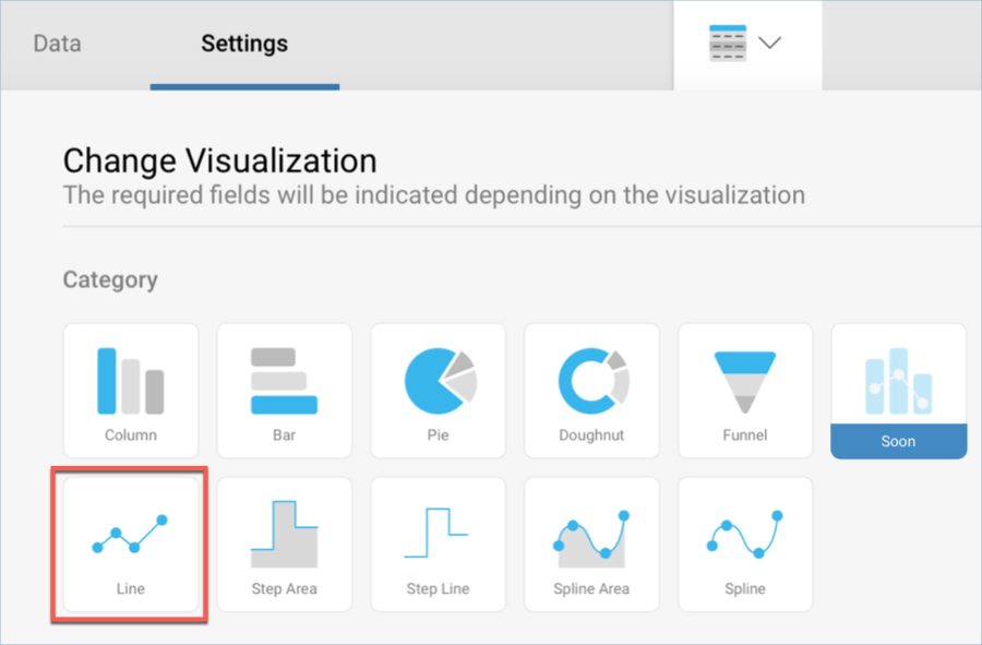
Open the visualizations picker by selecting the grid icon in the top bar, and select the "Line" chart.
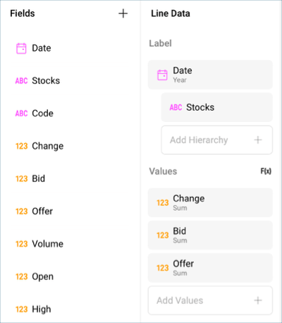
In the Data Editor, drag and drop the Date field into Label, Stocks into the Add Hierarchy section of Label, and Change, Bid and Offer into Values.
By default, the Date information in Label will be displayed in years. In order to change this, select Date in the Label placeholder of the data editor, and change the Date Aggregation to Month.
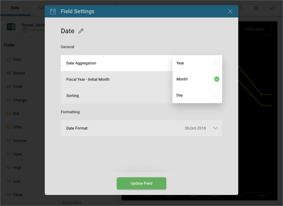
Then, select Update Field.
To remove the fraction digits in the Y axis, select the fields in Values, and change Fraction Digits to 0.
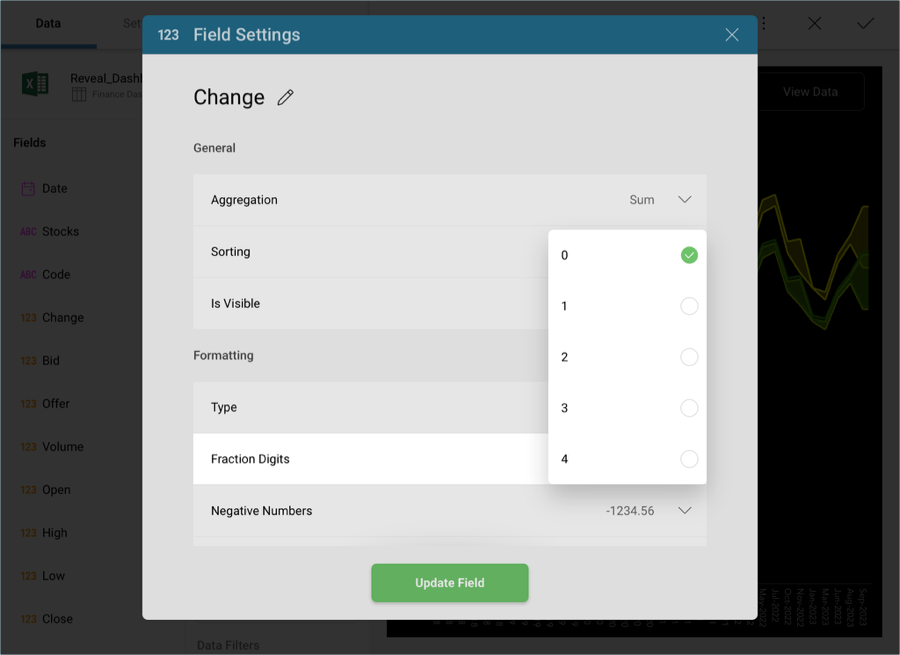
Then, select Update Field.
Change the title of your visualization to "Forecast (Chg, Bid & Offers) - 2018 to 2023" by selecting the pencil icon next to "Finance Dashboard".
Once you are done, go back to the Dashboard Editor by selecting the tick icon in the top right-hand corner.
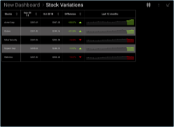
Stock Variations
The Stock Variations visualization displays the change in stock offers for a 12 month period in a sparkline chart. In order to create it:
Select the + button in the right corner of your dashboard, and select the Finance Dashboard sheet in the Analytics_Dashboard_Tutorials spreadsheet. Then, select Load Data.

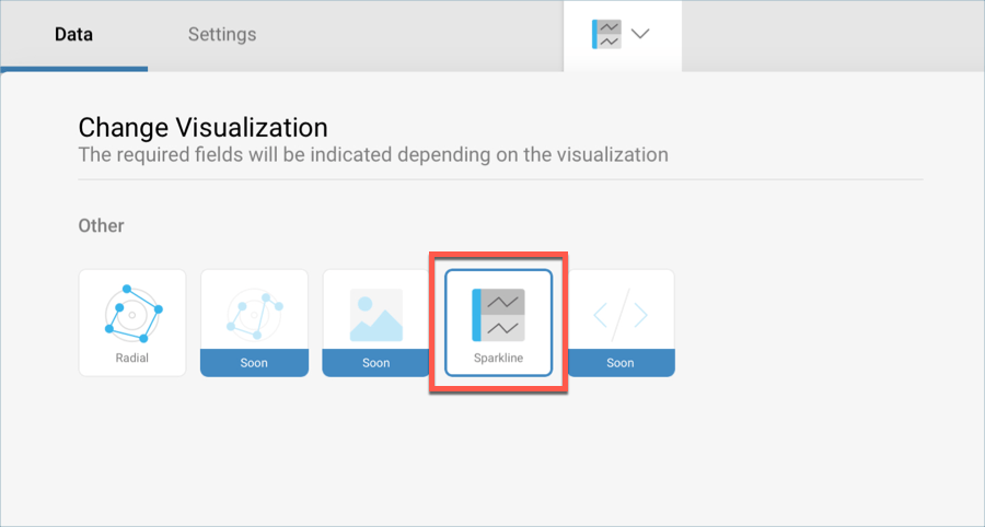
Open the visualizations picker by selecting the grid icon in the top bar, and select the "Sparkline" chart.
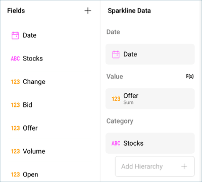
In the Data Editor, drag and drop the Date field into Date, the Offer field into Value and Stocks into Category.
By default, the Offer field will be displayed as a number. In order to display it as currency, select it in the data editor and change Type to Currency.
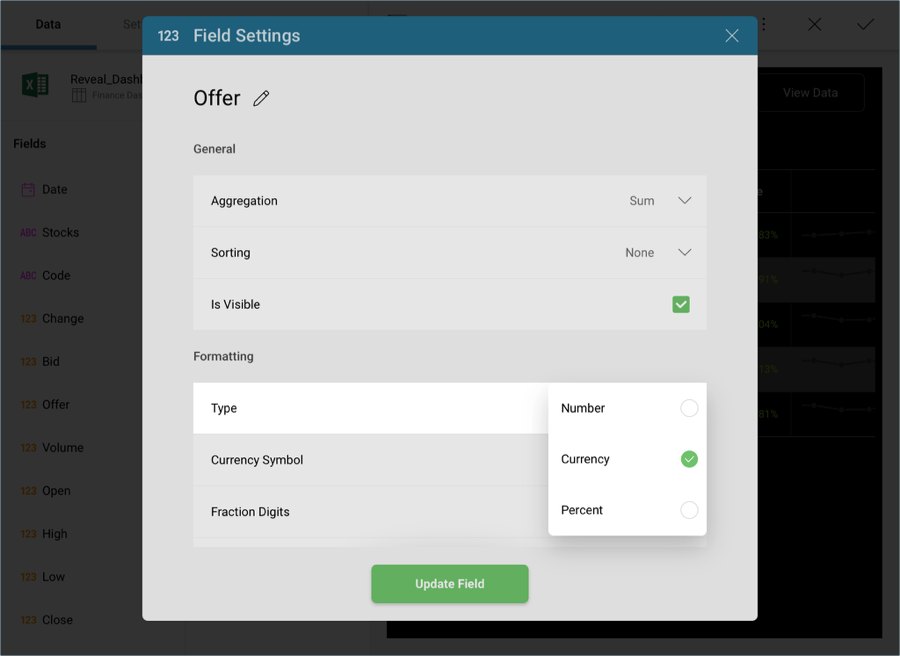
Then, select Update Field
The Last 12 Months chart will be displayed using a Line Chart by default. In order to match the sample, let's set it to display an area chart instead. Go to the Settings menu of the Visualizations Editor, open the Chart Type dropdown, and select Area.
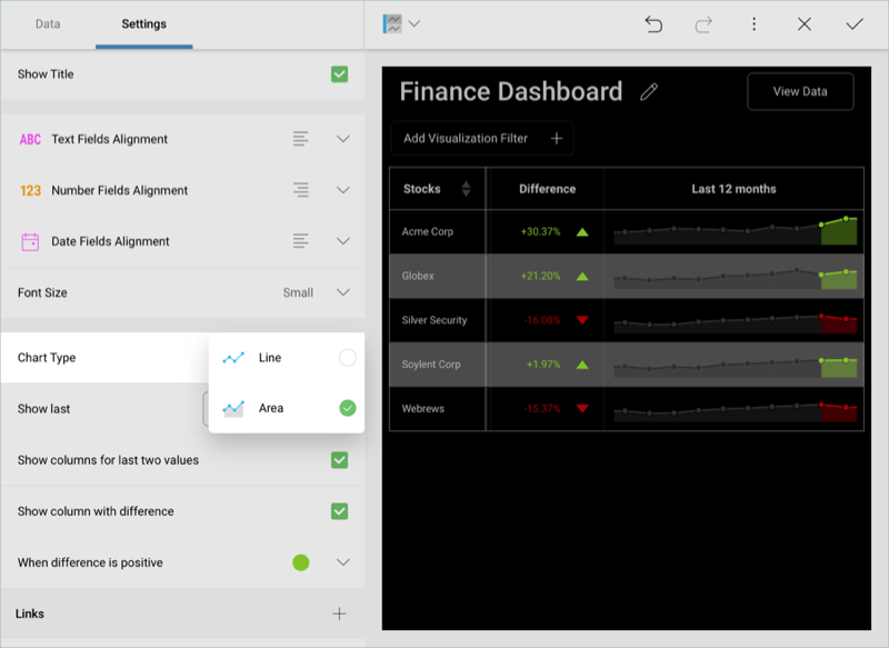
Change the title of your visualization to "Stock Variations" by selecting the pencil icon next to "Finance Dashboard".
Once you are done, go back to the Dashboard Editor by selecting the tick icon in the top right-hand corner.
Stock Volumes
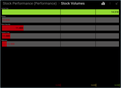
The Stock Volumes visualization displays the amount of stocks available during a one year period in a line gauge. In order to create it:
Select the + button in the right corner of your dashboard, and select the Finance Dashboard sheet in the Analytics_Dashboard_Tutorials spreadsheet. Then, select Load Data.

Open the visualizations picker by selecting the grid icon in the top bar, and select the "Sparkline" chart.
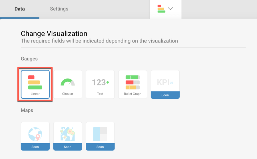
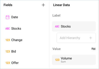
In the Data Editor, drag and drop the Stocks field into Label and the Volume field into the Values placeholder of the data editor.
You will also need to introduce a filter in order to display information only for 2018. To do this, drag and drop Date into the Data Filters placeholder of the data editor and, under Filter Type, select Filter by Rule.
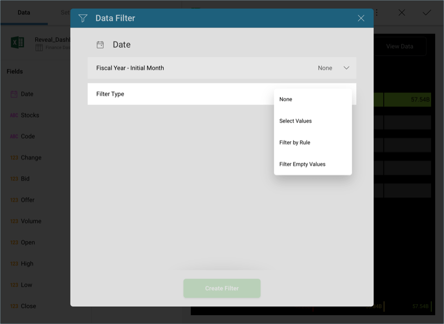
Select the Custom Date Range rule and enter January 1st through December 31st.
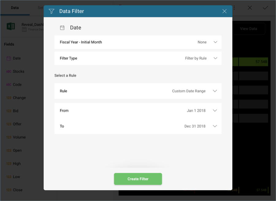
Then, select Create Filter.
Change the title of your visualization to "Stock Volumes" by selecting the pencil icon next to "Finance Dashboard".
Once you are done, go back to the Dashboard Editor by selecting the tick icon in the top right-hand corner.
