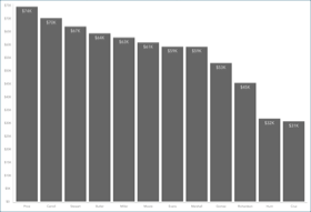
Adding the other Visualizations
All the remaining visualizations in the dashboards will use the same sample spreadsheet
Note
If you want to change your data source, you will need to select the overflow button next to the data source name or create a new data source instead. You can also duplicate visualizations to speed up the creation process.
This section will cover the following visualizations:
|
|
|
|
|
Production
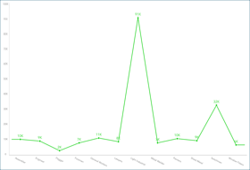
The Production visualization displays the amount of manufactured goods for a 12-month period arranged by worker type in a line chart. In order to create it:
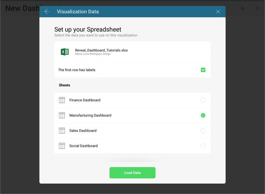
Select the + button in the right corner of your dashboard, and select the Manufacturing Dashboard sheet in the Analytics_Dashboard_Tutorials spreadsheet. Then, select Load Data.
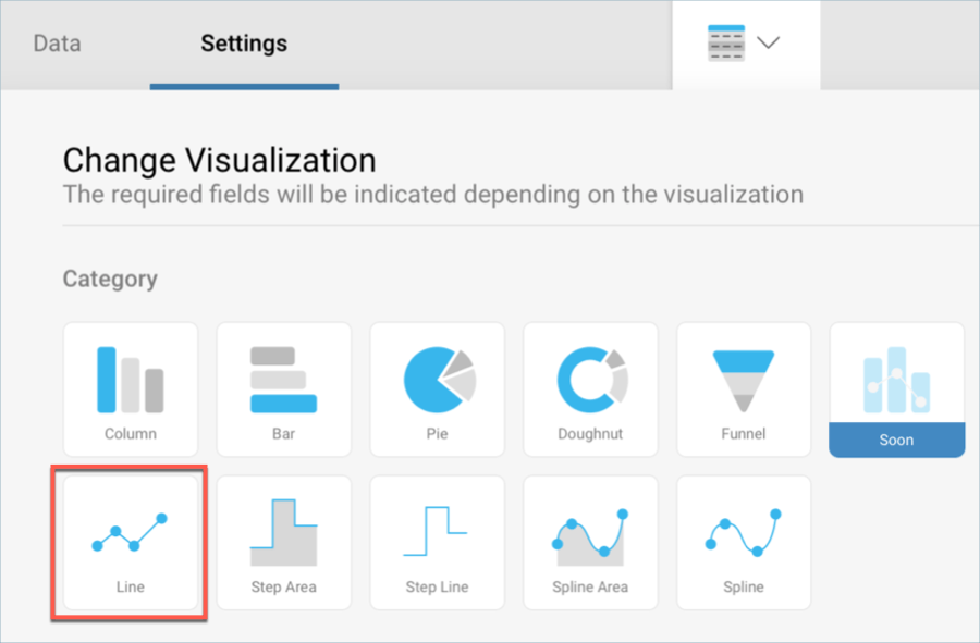
Open the visualizations picker by selecting the grid icon in the top bar, and select the "Line" chart.
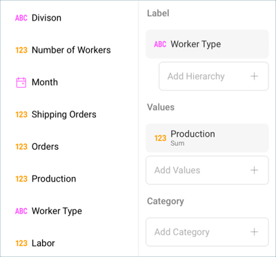
In the Data Editor, drag and drop the Worker Type field into Label, and the Production one into Values.
Because the Production field has information on goods that were manufactured, the fraction digits should be removed. Select Production in Values, and change Fraction Digits to 0 under Formatting.
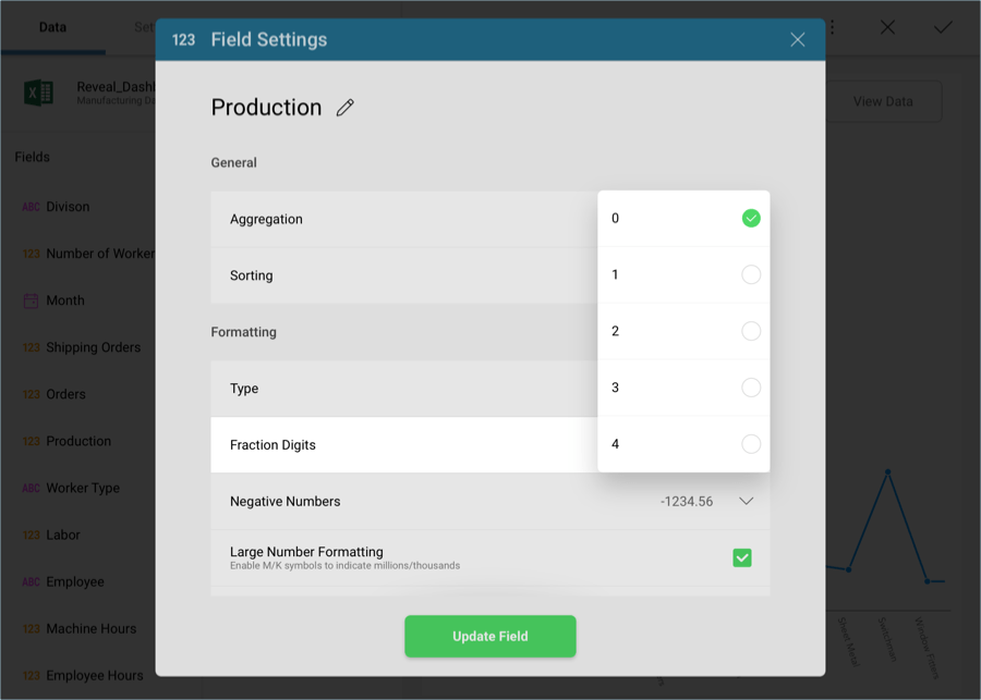
Then, select Update Field.
For the line chart to match the color in the sample visualization, change the Start Color to the fifth one within the Settings screen of the Visualizations Editor.
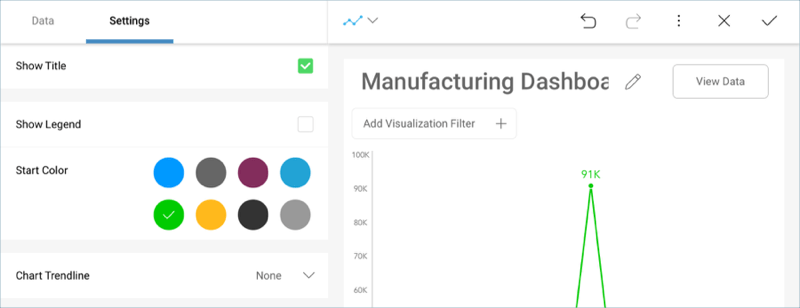
Change the title of your visualization to "Production" by selecting the pencil icon next to "Manufacturing Dashboard".
Once you are done, go back to the Dashboard Editor by selecting the tick icon in the top right-hand corner.
Shipping
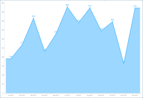
The Shipping visualization displays the amount of shipped orders for a 12 month period in an area chart. In order to create it:
Select the + button in the right corner of your dashboard, and select the Manufacturing Dashboard sheet in the Analytics_Dashboard_Tutorials spreadsheet. Then, select Load Data.

Open the visualizations picker by selecting the grid icon in the top bar, and select the "Area" chart.

In the Data Editor, drag and drop the Month field into Label, and the Shipping Orders one into Values.
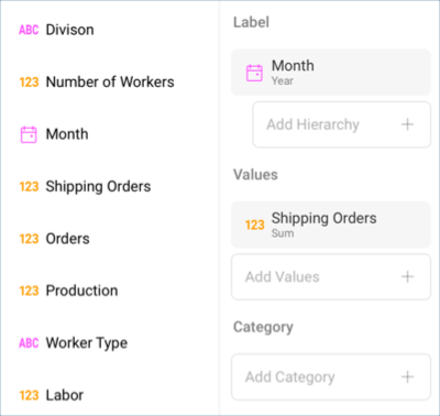
By default, the date aggregation for your information will be set to Year. To change this, select the Month field in the Label placeholder, and change the Date Aggregation to Month.
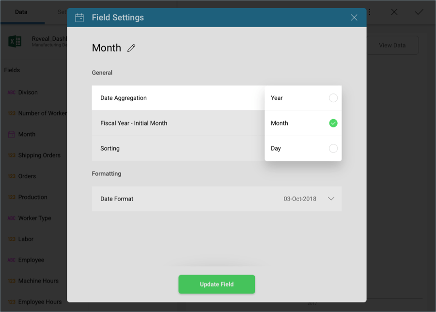
Then, select Update Field.
Because the Shipping Orders field has information on goods that were shipped to clients, the fraction digits should be removed. Select Shipping Orders in Values, and change Fraction Digits to 0 under Formatting.
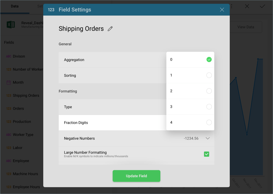
Then, select Update Field.
Change the title of your visualization to "Shipping" by selecting the pencil icon next to "Manufacturing Dashboard".
Once you are done, go back to the Dashboard Editor by selecting the tick icon in the top right-hand corner.
Average Hours
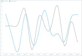
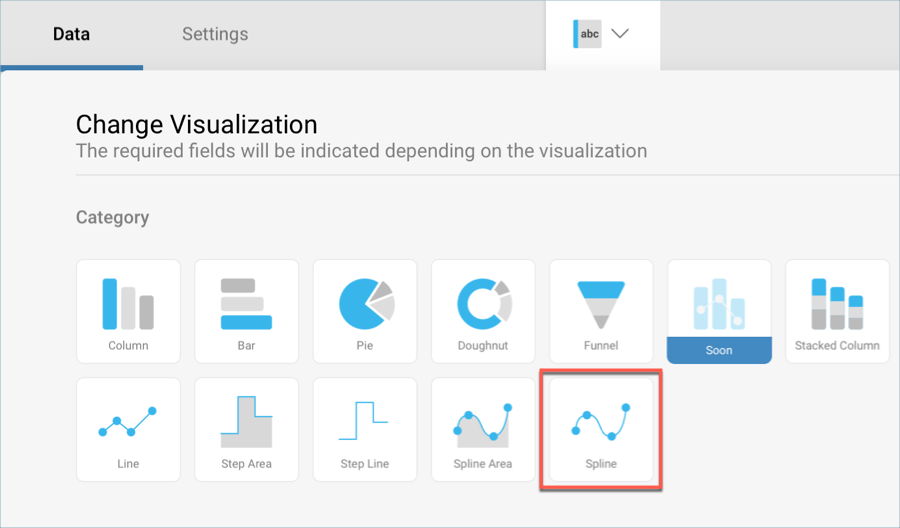
The Average Hours visualization displays hours logged by the company's employees compared to the hours they spent on the company's machinery broken down by month in a spline chart. In order to create it:
Select the + button in the right corner of your dashboard, and select the Manufacturing Dashboard sheet in the Analytics_Dashboard_Tutorials spreadsheet. Then, select Load Data.

Open the visualizations picker by selecting the grid icon in the top bar, and select the "Area" chart.
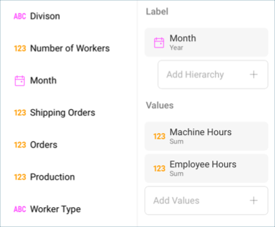
In the Data Editor, drag and drop the Month field into Label, and both the Machine Hours and the Employee Hours fields into Values.
By default, the date aggregation for your information will be set to Year. To change this, select the Month field in the Label placeholder, and change the Date Aggregation to Month.

Then, select Update Field.
To match the sample visualization, remove the fraction digits for hours by selecting both Average Hours and Machine Hours from the Values placeholder, and change Fraction Digits to 0 under Formatting.
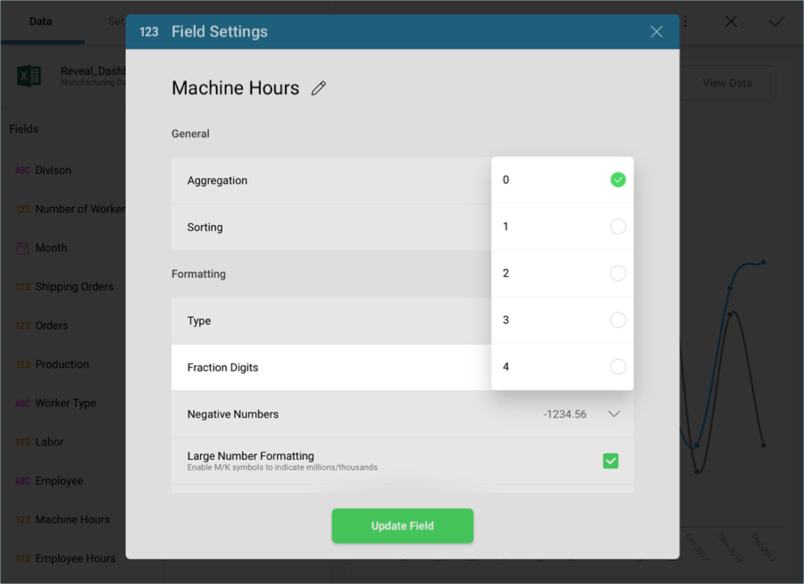
Then, select Update Field.
Change the title of your visualization to "Average Hours" by selecting the pencil icon next to "Manufacturing Dashboard".
Once you are done, go back to the Dashboard Editor by selecting the tick icon in the top right-hand corner.
Headcount
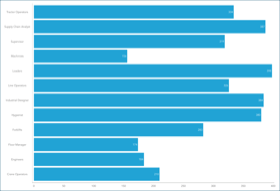
The Headcount visualization displays the amount of workers broken down by category in a bar chart. In order to create it:
Select the + button in the right corner of your dashboard, and select the Manufacturing Dashboard sheet in the Analytics_Dashboard_Tutorials spreadsheet. Then, select Load Data.

Open the visualizations picker by selecting the grid icon in the top bar, and select the "Area" chart.
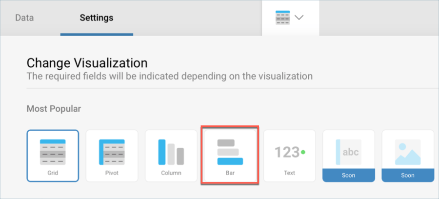
In the Data Editor, drag and drop the Division field into Label, and the Number of Workers one into Values.
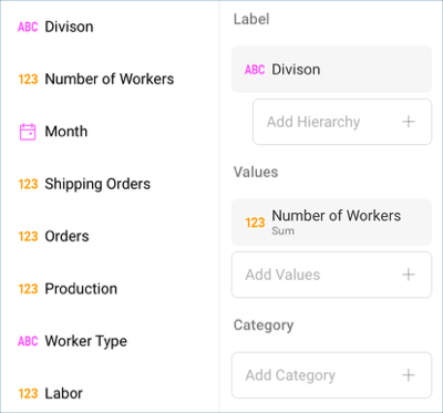
The Number of Workers field should display no fraction digits because of the information it contains refers to people. Select it from the Values placeholder, and change Fraction Digits to 0 under Formatting.
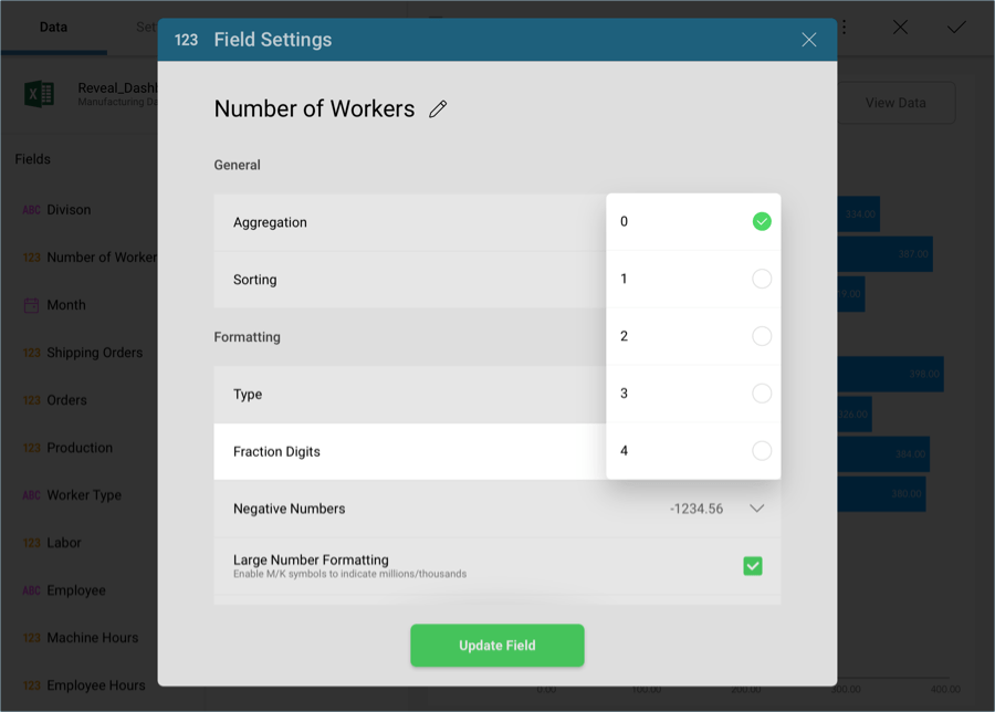
Then, select Update Field.
For the bar chart to match the color in the sample visualization, change the Start Color to the fourth one within the Settings screen of the Visualizations Editor.
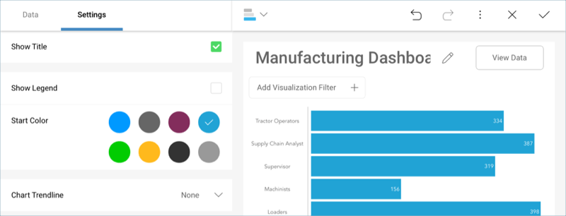
Change the title of your visualization to "Headcount" by selecting the pencil icon next to "Manufacturing Dashboard".
Once you are done, go back to the Dashboard Editor by selecting the tick icon in the top right-hand corner.
Labor Cost
The Labor Cost visualization displays the wages for each employee from highest to lowest in a column chart. In order to create it:
Select the + button in the right corner of your dashboard, and select the Manufacturing Dashboard sheet in the Analytics_Dashboard_Tutorials spreadsheet. Then, select Load Data.

Open the visualizations picker by selecting the grid icon in the top bar, and select the "Area" chart.
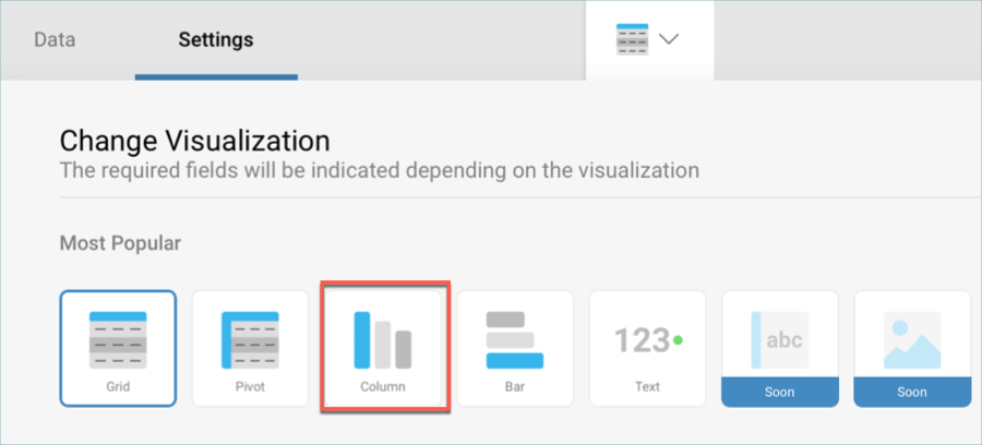
In the Data Editor, drag and drop the Employee field into Label, and the Labor one into Values.

The Labor figures should be formatted to be shown as currency and with no fraction digits. In order to do this, select the Labor field from the Values placeholder and apply the following changes:
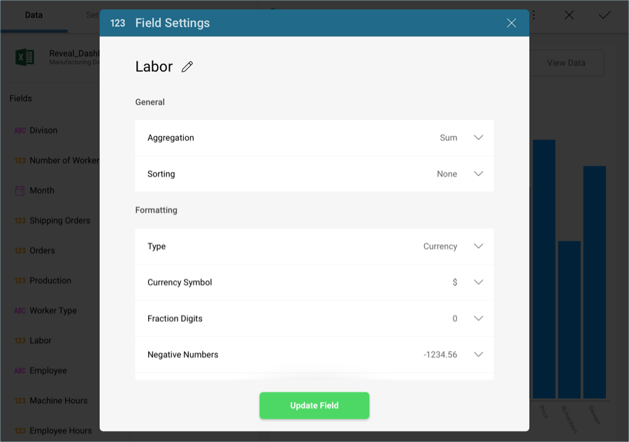
Type: Currency
Fraction Digits: 0
In addition, the visualization displays the wages in descending order. In this same dialog, change the Sorting from None to Descending.
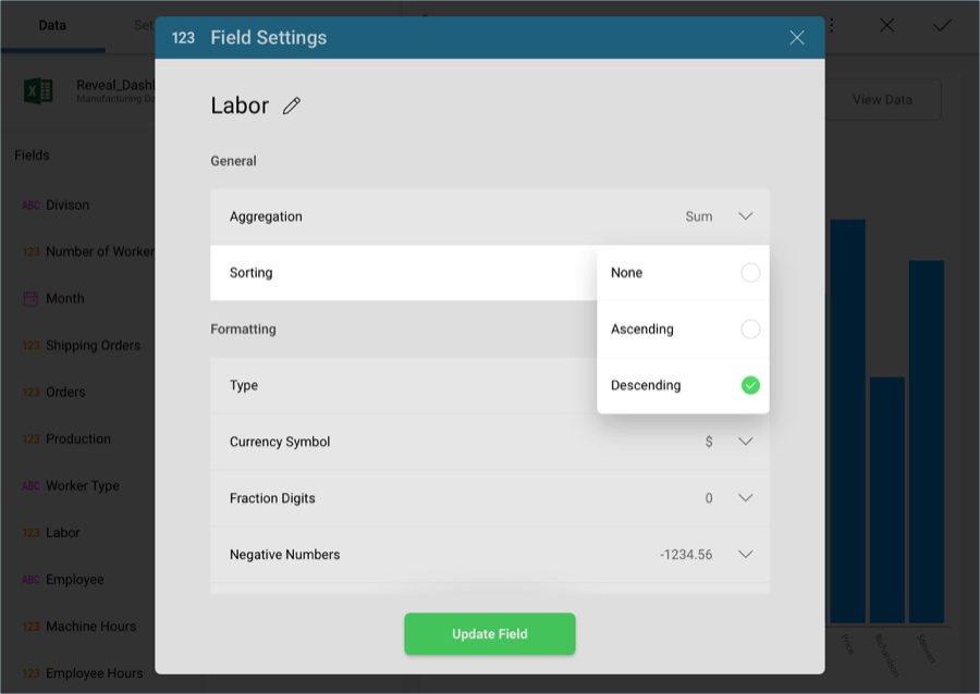
Then, select Update Field.
For the column chart to match the color in the sample visualization, change the Start Color to the second one within the Settings screen of the Visualizations Editor.
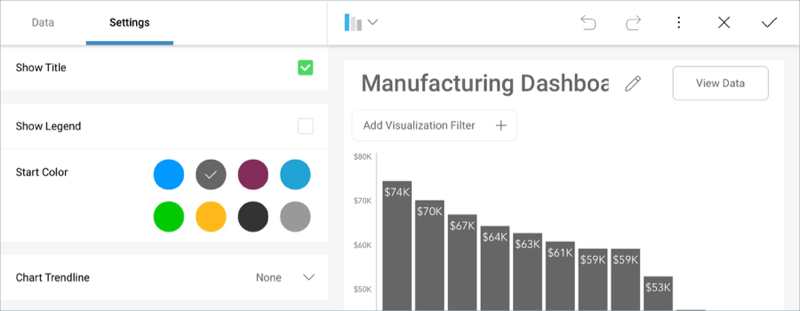
Change the title of your visualization to "Labor Cost" by selecting the pencil icon next to "Manufacturing Dashboard".
Once you are done, go back to the Dashboard Editor by selecting the tick icon in the top right-hand corner.
