Adding the Other Visualizations
All the remaining visualizations in the dashboards will use the same sample spreadsheet.
If you want to change your data source, you will need to select the overflow button next to the data source name or create a new data source instead. You can also duplicate visualizations to speed up the creation process.
This section will cover the following visualizations:
|
|
|
|
|
|
Followers
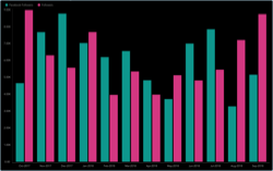
The Followers visualization displays the amount of followers broken down by social media channel in a column chart. In order to create it:
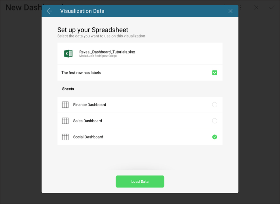
Select the + button in the right corner of your dashboard. In the New Visualization dialog, select the Analytics_Dashboard_Tutorials spreadsheet in the Data in Dashboard section. Make sure the Social Dashboard option is selected, and then press Load Data.
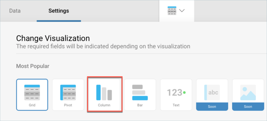
Open the visualizations picker by selecting the grid icon in the top bar, and select the "Column" chart.
In the Data Editor, drag and drop the Date field into Label, and the Facebook Followers by Year and Twitter Followers by Year fields into Values.
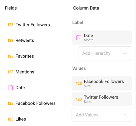
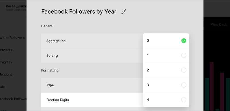
By default, both the Facebook and Twitter followers will be expressed with two fraction digits. In order to change this, select the fields in the data editor, and, under Formatting change the Fraction Digits to 0 for both fields.
In the sample Followers visualization, dates are displayed as months. Select the Date field in Label, and set the Date Aggregation to Month. Then, select Update Field.

Connect your visualization to the existing dashboard filter by selecting Connect under Date Filter. You can find this menu above "Social Dashboard".

Change the title of your visualization to "Followers" by selecting the pencil icon next to "Social Dashboard".
Once you are done, go back to the Dashboard Editor by selecting the tick icon in the top right-hand corner.
YTD Facebook Followers
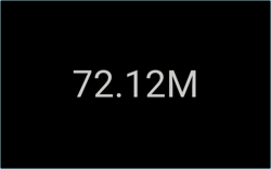
The YTD Facebook Followers visualization displays the amount of followers for that social media channel in a text gauge. In order to create it:
Select the + button in the right corner of your dashboard. In the New Visualization dialog, select the Analytics_Dashboard_Tutorials spreadsheet in the Data in Dashboard section. Make sure the Social Dashboard option is selected, and then press Load Data.

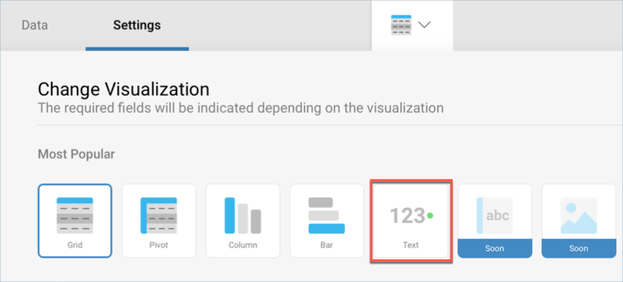
Open the visualizations picker by selecting the grid icon in the top bar, and select the "Text" gauge.
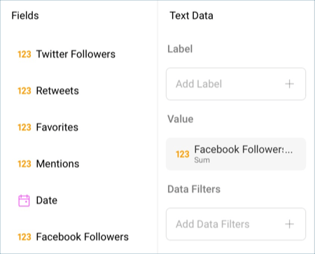
In the Data Editor, drag and drop the Facebook Followers by Year field into the Value placeholder.
Connect your visualization to the existing dashboard filter by selecting Connect under Date Filter. You can find this menu above "Social Dashboard".

Change the title of your visualization to "YTD Facebook Followers" by selecting the pencil icon next to "Social Dashboard".
Once you are done, go back to the Dashboard Editor by selecting the tick icon in the top right-hand corner.
Monthly Facebook Likes
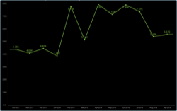
The Monthly Facebook Likes visualization displays the amount of Facebook likes per month for the company in a line chart. In order to create it:
Select the + button in the right corner of your dashboard. In the New Visualization dialog, select the Analytics_Dashboard_Tutorials spreadsheet in the Data in Dashboard section. Make sure the Social Dashboard option is selected, and then press Load Data.

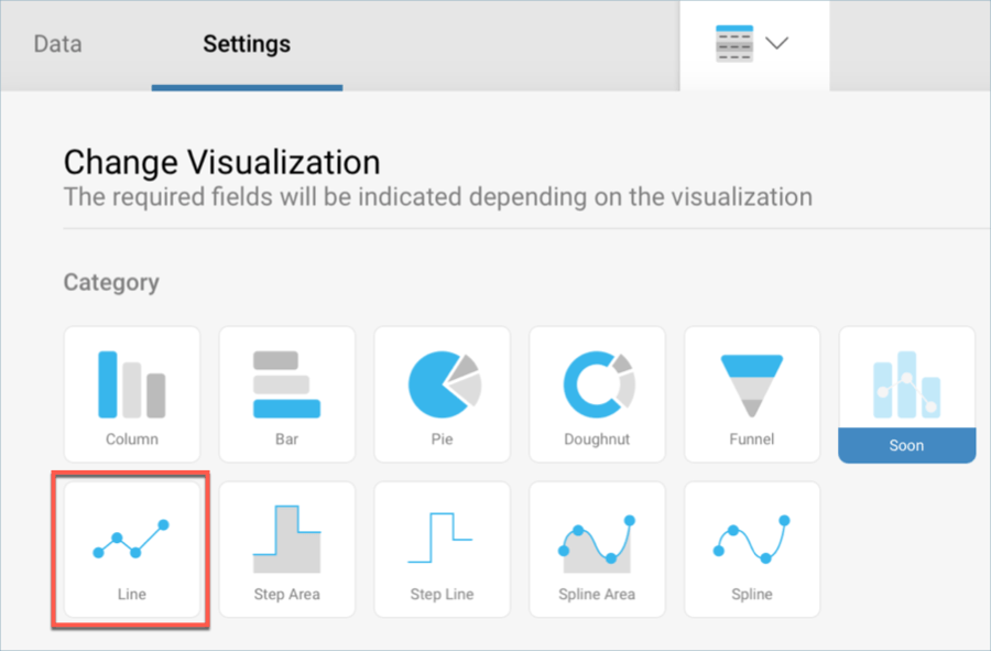
Open the visualizations picker by selecting the grid icon in the top bar, and select the "Line" chart.
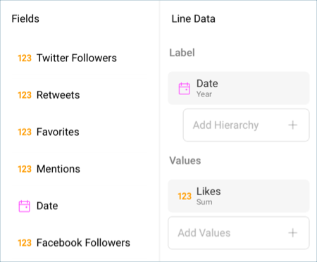
In the Data Editor, drag and drop the Date field into Label and Likes into the Values placeholder of the data editor.
In the sample Monthly Facebook Likes visualization, dates are displayed as months. Select the Date field in Label, and set the Date Aggregation to Month. Then, select Update Field.

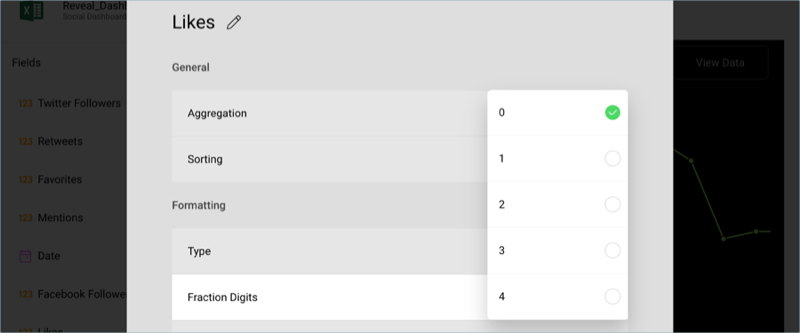
By default, Likes will be expressed with two fraction digits. In order to change this, select the fields in the data editor, and, under Formatting change the Fraction Digits to 0 for both fields.
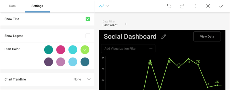
To match the sample visualization's color, change the Start Color to the fourth one within the same Settings screen.
Connect your visualization to the existing dashboard filter by selecting Connect under Date Filter. You can find this menu above "Social Dashboard".

Change the title of your visualization to "Monthly Likes" by selecting the pencil icon next to "Social Dashboard".
Once you are done, go back to the Dashboard Editor by selecting the tick icon in the top right-hand corner.
Retweets & Favorites
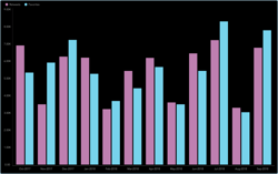
The Retweets & Favorites visualization displays the amount of Twitter retweets and favorited posts per month for the company in a column chart. In order to create it:
Select the + button in the right corner of your dashboard. In the New Visualization dialog, select the Analytics_Dashboard_Tutorials spreadsheet in the Data in Dashboard section. Make sure the Social Dashboard option is selected, and then press Load Data.

Open the visualizations picker by selecting the grid icon in the top bar, and select the "Column" chart.

In the Data Editor, drag and drop the Date field into Label, and both Retweets and Favorites into the Values placeholder of the data editor.
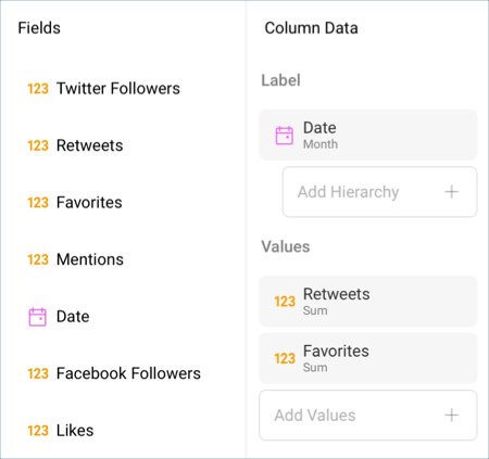
In the sample Retweets & Favorites visualization, dates are displayed as months. Select the Date field in Label, and set the Date Aggregation to Month. Then, select Update Field.

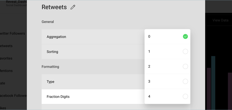
By default, Retweets & Favorites will be expressed with two fraction digits. In order to change this, select the fields in the data editor, and, under Formatting change the Fraction Digits to 0 for both fields.
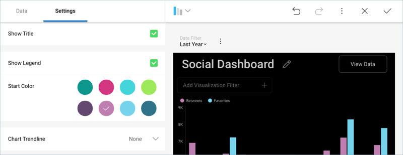
To match the sample visualization's color, change the Start Color to the sixth one within the same Settings screen.
Connect your visualization to the existing dashboard filter by selecting Connect under Date Filter. You can find this menu above "Social Dashboard".

Change the title of your visualization to "Retweets & Favorites" by selecting the pencil icon next to "Social Dashboard".
Once you are done, go back to the Dashboard Editor by selecting the tick icon in the top right-hand corner.
Facebook Reach vs. Impressions
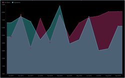
The Facebook Reach vs. Impressions visualization displays the amount of reaches and impressions through Facebook for the company in an area chart. In order to create it:
Select the + button in the right corner of your dashboard. In the New Visualization dialog, select the Analytics_Dashboard_Tutorials spreadsheet in the Data in Dashboard section. Make sure the Social Dashboard option is selected, and then press Load Data.

Open the visualizations picker by selecting the grid icon in the top bar, and select the "Area" chart.

In the Data Editor, drag and drop the Date field into Label, and both Post Reach and Impressions into the Values placeholder of the data editor.
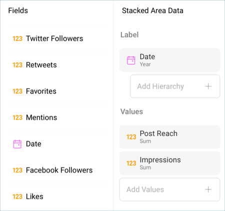
In the sample Facebook Reach vs. Impressions visualization, dates are displayed as months. Select the Date field in Label, and set the Date Aggregation to Month. Then, select Update Field.

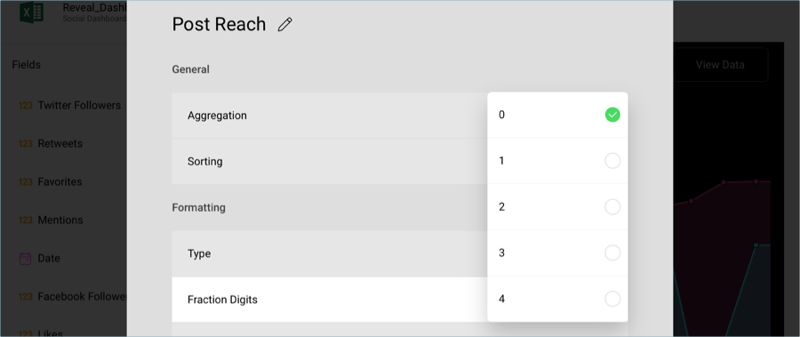
By default, Post Reach and Impressions will be expressed with two fraction digits. In order to change this, select the fields in the data editor, and, under Formatting change the Fraction Digits to 0 for both fields.
Connect your visualization to the existing dashboard filter by selecting Connect under Date Filter. You can find this menu above "Social Dashboard".

Change the title of your visualization to "Facebook Reach vs. Impressions" by selecting the pencil icon next to "Social Dashboard".
Once you are done, go back to the Dashboard Editor by selecting the tick icon in the top right-hand corner.
Monthly Twitter Mentions
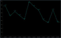
The Monthly Twitter mentions visualization displays the amount of mentions through Twitter for the company in a line chart. In order to create it:
Select the + button in the right corner of your dashboard. In the New Visualization dialog, select the Analytics_Dashboard_Tutorials spreadsheet in the Data in Dashboard section. Make sure the Social Dashboard option is selected, and then press Load Data.

Open the visualizations picker by selecting the grid icon in the top bar, and select the "Line" chart.

In the Data Editor, drag and drop the Date field into Label, and both Mentions into the Values placeholder of the data editor.
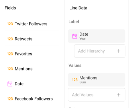
In the sample Monthly Twitter Mentions visualization, dates are displayed as months. Select the Date field in Label, and set the Date Aggregation to Month. Then, select Update Field.

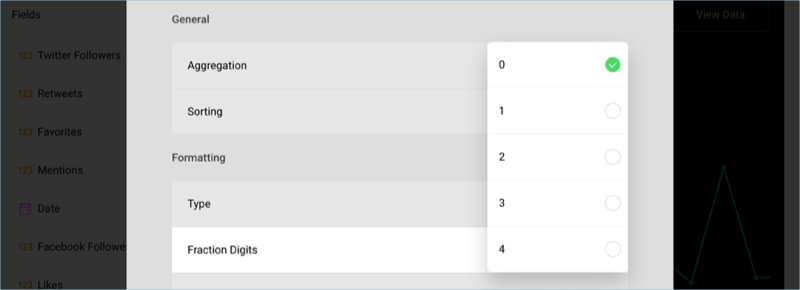
By default, Mentions will be expressed with two fraction digits. In order to change this, select the fields in the data editor, and, under Formatting change the Fraction Digits to 0 for both fields.
Connect your visualization to the existing dashboard filter by selecting Connect under Date Filter. You can find this menu above "Social Dashboard".
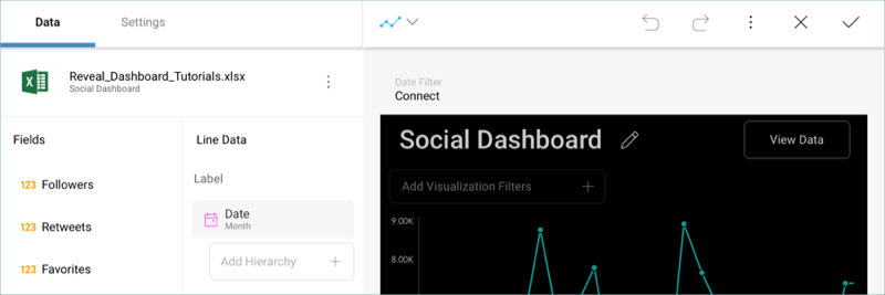
Change the title of your visualization to "Monthly Twitter Mentions" by selecting the pencil icon next to "Social Dashboard".
Once you are done, go back to the Dashboard Editor by selecting the tick icon in the top right-hand corner.
