
How Stephen Gould Scaled Its Capacity by 30% without Making a Single Hire

With a full business intelligence engine inside Slingshot, you can quickly connect to your different data sources and create dashboards within minutes.
If you are not familiar with creating dashboards in Slingshot, it can be a little overwhelming trying to figure out how to connect to all the data you have in different systems and build a dashboard to bring all your data together into a full 360-degree view of your business.
Slingshot aggregates data analytics, project and information management, chat, and goals-based strategy benchmarking – all in one, intuitive app. With a full business intelligence engine inside Slingshot, you can quickly connect to your different data sources and create dashboards within minutes.
Keep reading to see how to achieve this quickly with the following steps, using a sample data Excel file provided for you inside the application.
Within both your My Overview area and any Workspace in Slingshot, you can create dashboards from the Analytics tab.
For this tutorial, let’s work from My Overview.
First, we want to navigate to the Analytics tab and click the +New button, and select a dashboard from the drop-down:
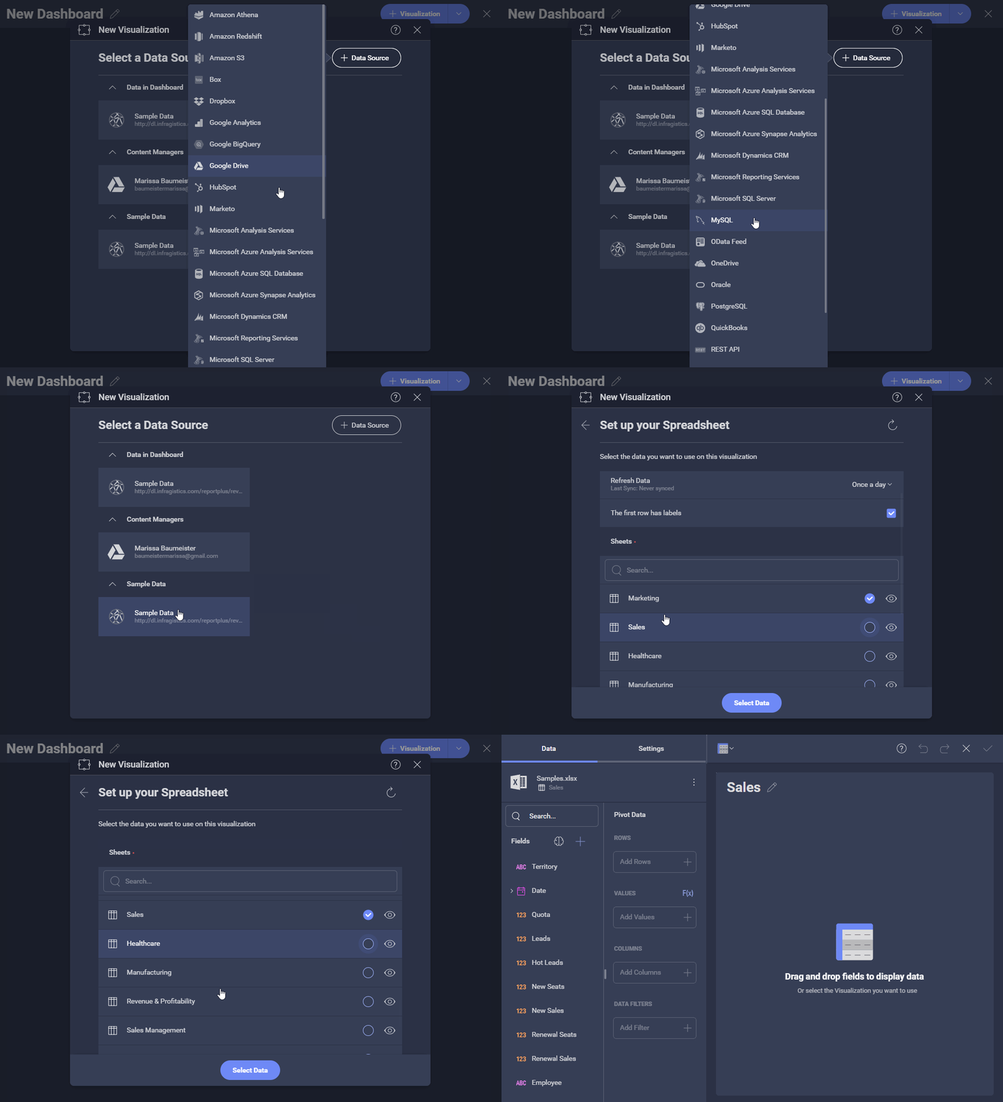
Next, you are prompted to select your data source.
Using the +Data Source button, you can see all of the data sources you can directly connect to inside Slingshot.
We also offer you a sample data set to get your toes wet with analytics! That is exactly what we are going to use – so, let’s click sample data.
In the next screen, you will see all the sheets within the Excel file and their names. You can preview the data set using the eye icon. Everyone can relate to sales, so we choose the Sales sheet for this demonstration.
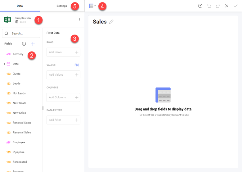
Before we create our first visualization, let’s give you a quick tour of the visualization editor:
Now that you understand the editor – let’s create your first visualization!
We are going to follow these steps:
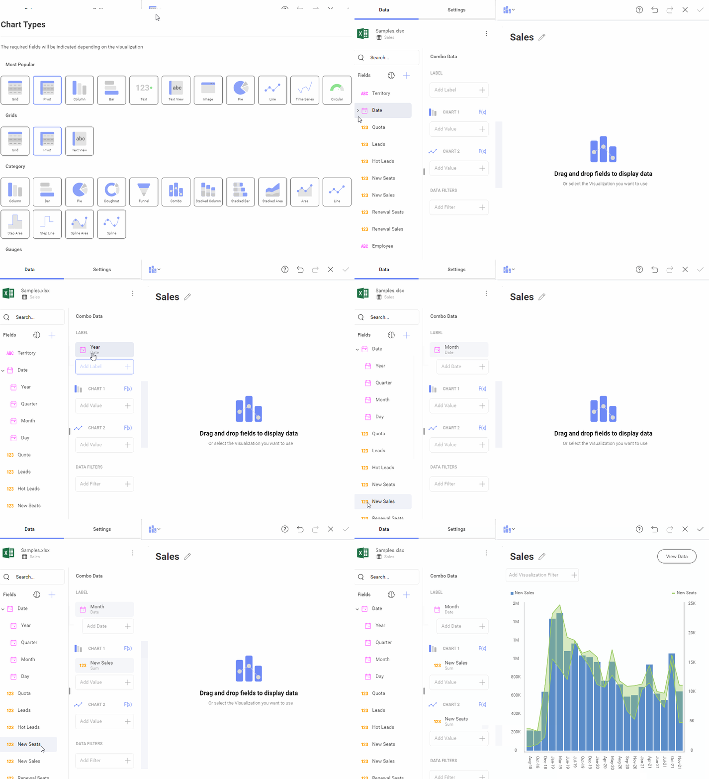
And just like that, your first visualization is created! Now give it a title and hit the check-in at the top right:
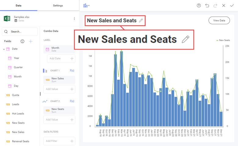
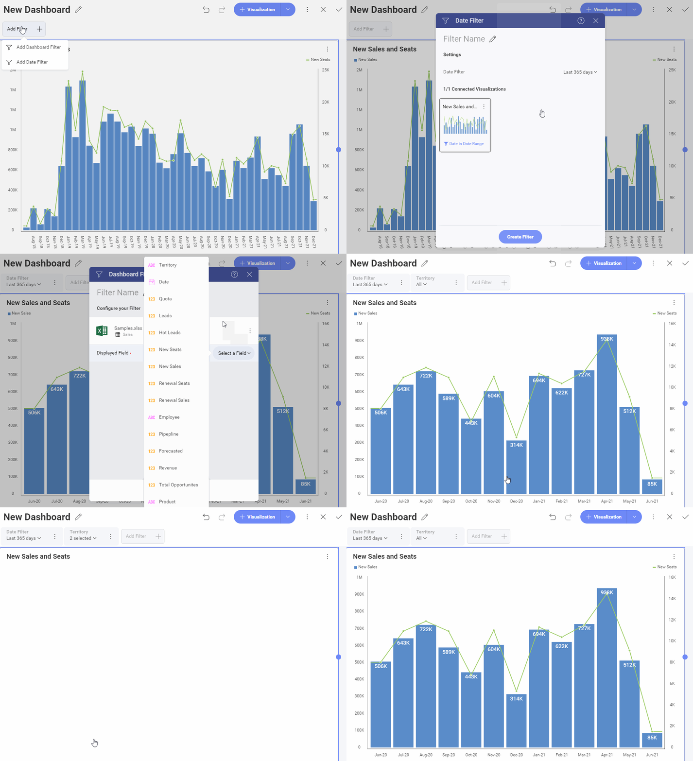
Next, we are going to create some dashboard-level filters. These filters allow you to connect any or all visualizations to them to further slice and dice your data.
For this example, we will add date and territory filters.
Simply navigate to the top left under the New Dashboard title and select + Add Filter.
You will want to select a date filter, connect our visualization set your date range, and click Create a filter.
Slingshot will automatically connect both like values in this filter as long as there is only one date field – if there is more than one, you are prompted to select.
You can do the same thing by adding a dashboard filter for territory:
You’ve done it!
You’ve created your first dashboard in Slingshot.
So once you are happy with your dashboard – just give it a name, hit the check on the top right, and save it wherever you wish.
Want to know Slingshot even better? Check out these 9 project management features to improve your team’s productivity.